IBM has been a technical giant for over a century. It has lots of great traditions as well as bad ones. One of the projects I was involved in, was quite intensive yet inefficient at the beginning. I tried a few things to make the design process a bit smoother, and more clear to the whole project team.
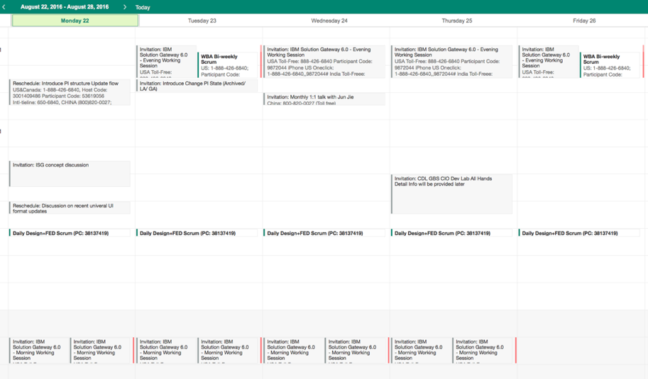
Meetings, meetings, meetings
The project team was composed by members from 3 offices in China and 2 offices in US, plus a couple of remote working members. It was already quite a complex combination.
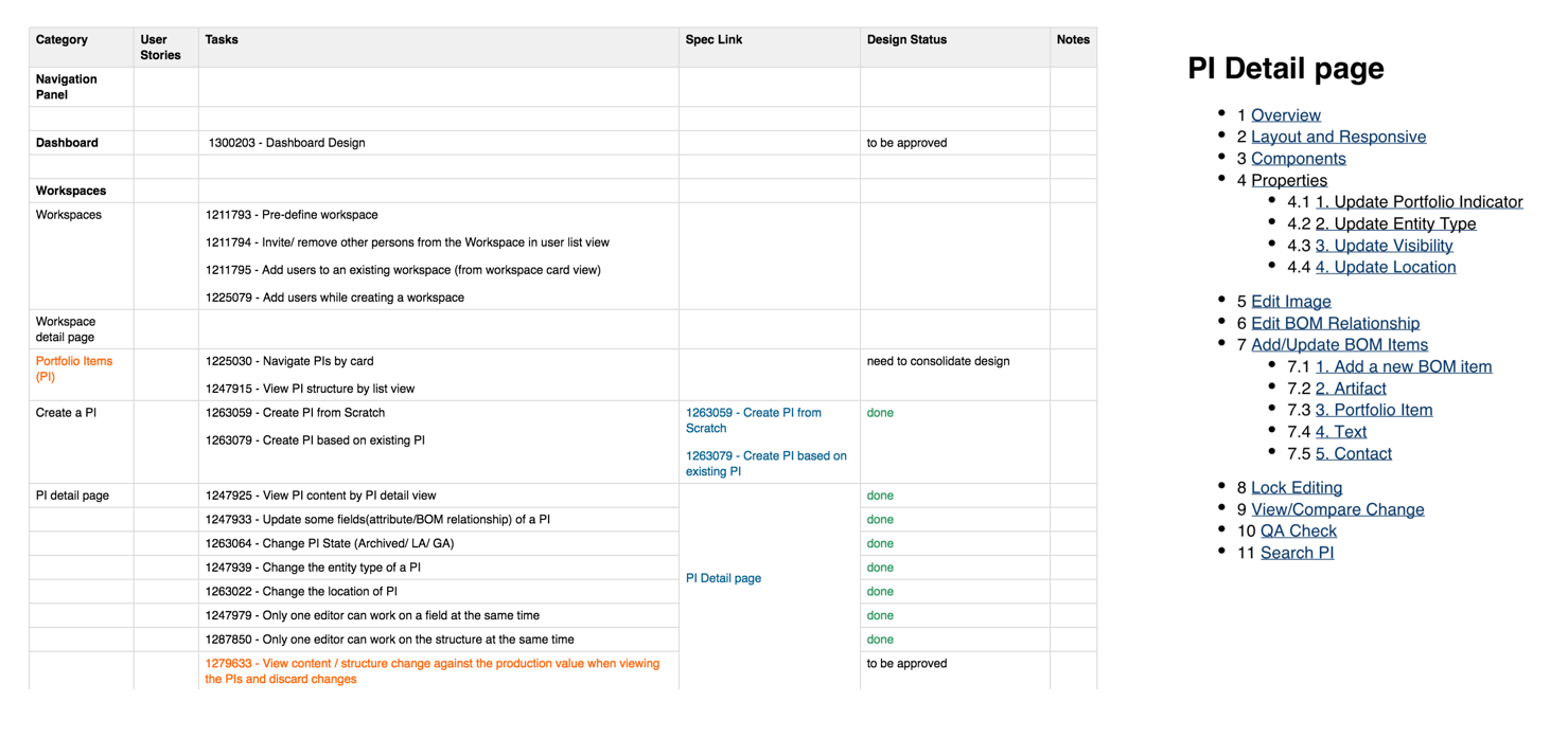
By the time I joined the team, it had already run a while and lots of things were already in-progress. However, things were not very well documented. It was quite difficult for people joined in the middle to understand what has been done and what need to do.
In order to get everybody onboard, the project managers organized tons of regular meetings everyday to discuss almost every single detail of the project. The first meeting starts at 9:30am in the morning, and the last one ends at 10:30 pm for almost everyday.
Unreadable documentations
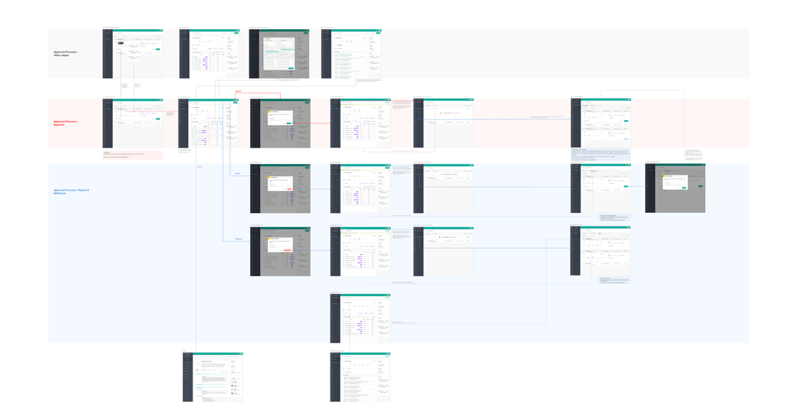
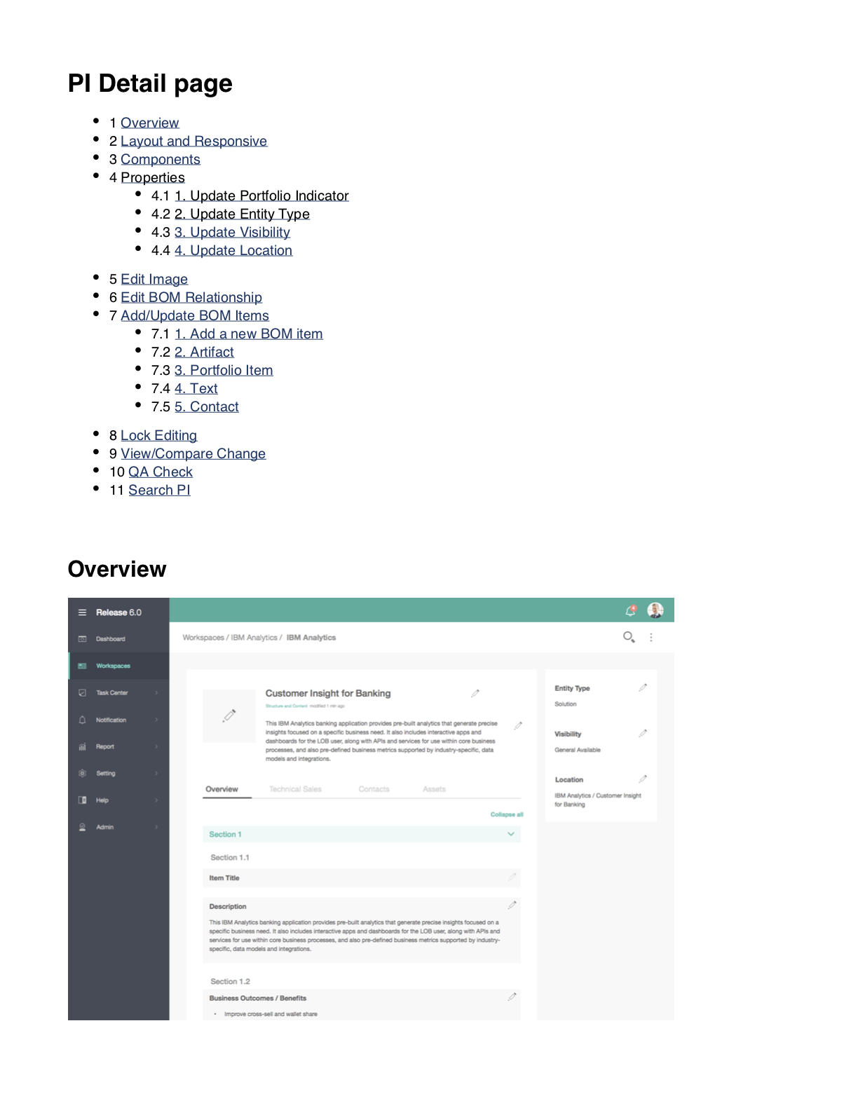
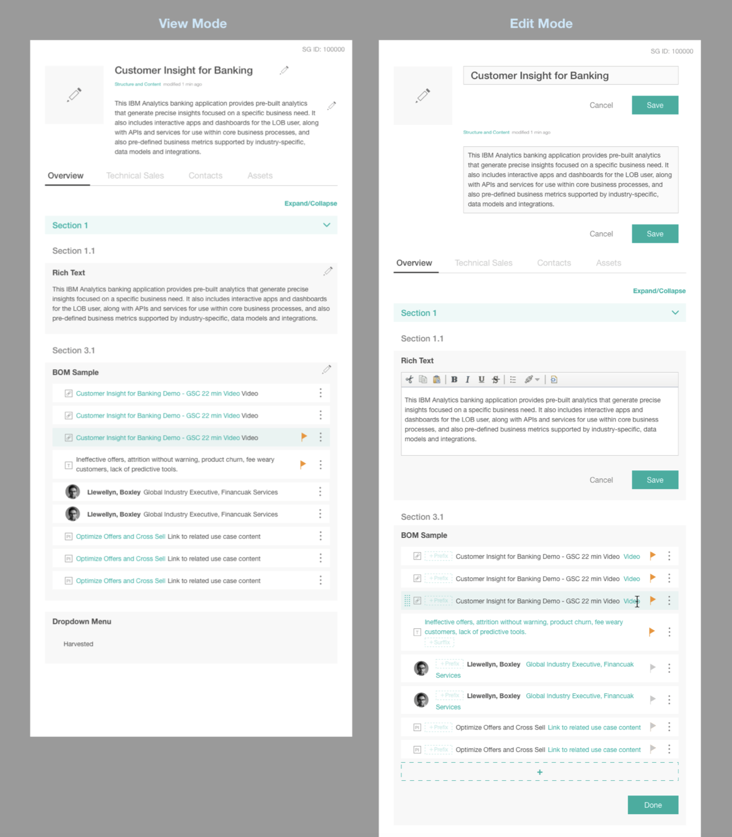
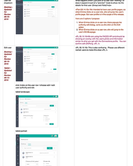
Too much things were discussed during everyday meetings, all the discussed topics were recoded on a wiki page with all necessary screenshots, annotations, markups, etc.. It seemed to be a good idea to keep everything in one places, however, after months, 80% of the document were out-dated and there's no way for a new member to filter out which information was still valid.
