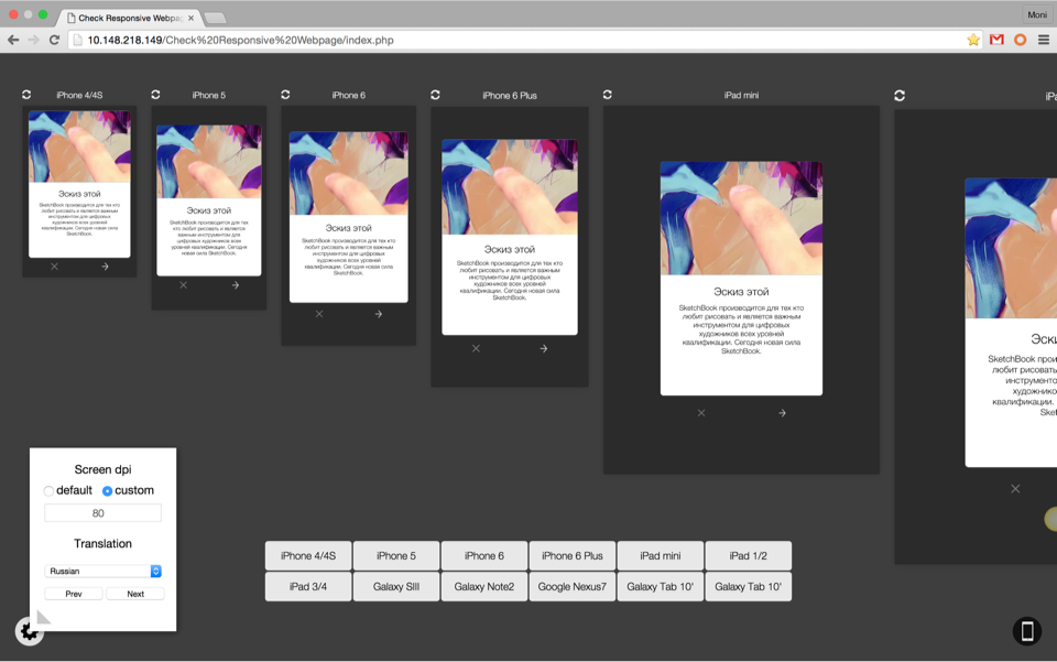
A system to preview how an in-app page would look like in the real life. With some simple configurations, we can preview the layouts in all different screen sizes and with 24 different languages.
It's cool, but too complicated
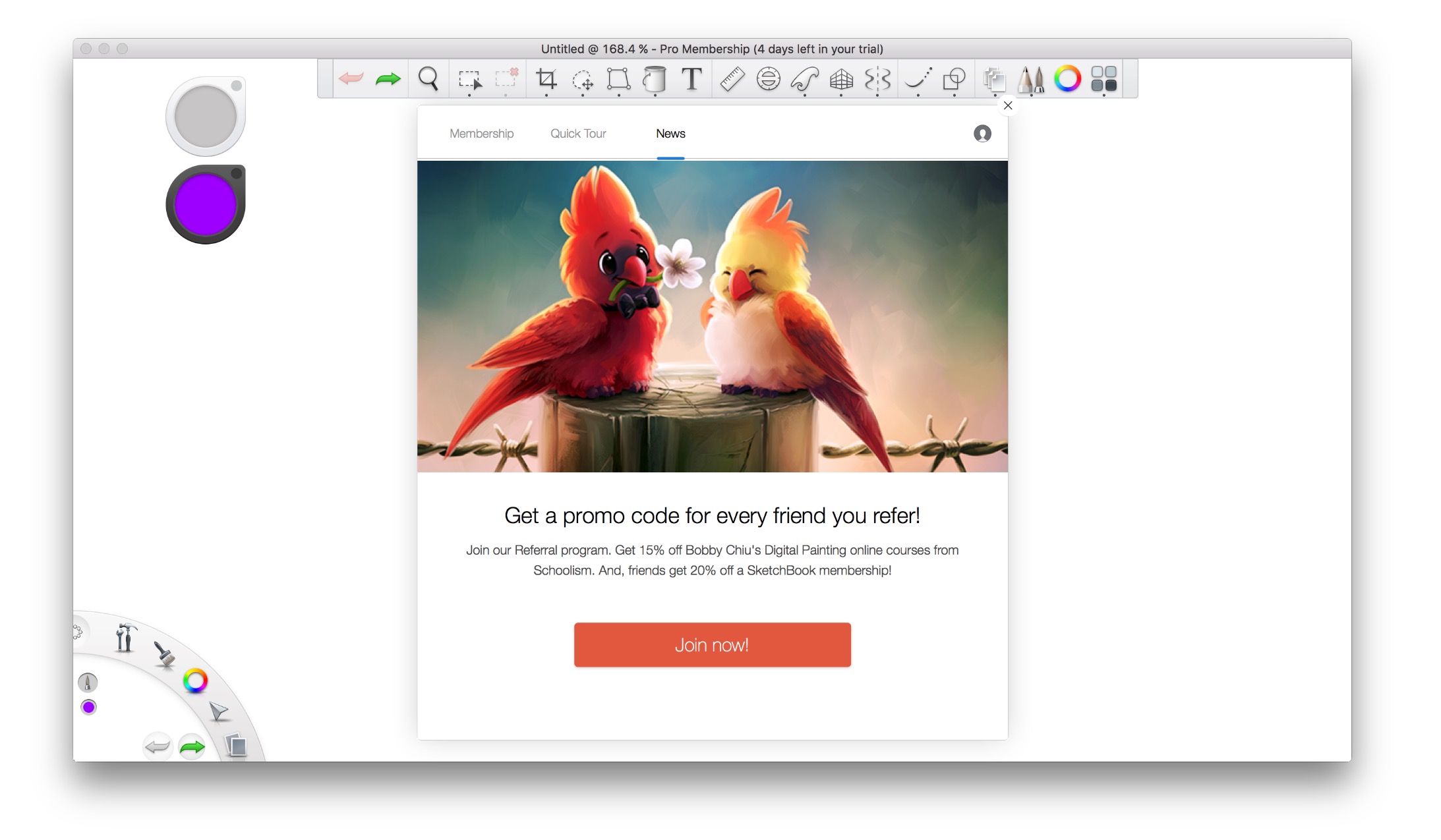
We built an in-app notification system in SketchBook so that we could send messages to our users. It was basically an embed web view, what we wanted to do is to push the pre-braked HTML files into that frame.
The framework was initially meant to send users information like "what's new in the new version" thus to drive them to upgrade. Once the service was out, the marketing team realized that they could also send important marketing messages to our users. That would be much more efficient than the traditional ways, because we are sending the messages to the target users directly.
The framework was initially meant to send users information like "what's new in the new version" thus to drive them to upgrade. Once the service was out, the marketing team realized that they could also send important marketing messages to our users. That would be much more efficient than the traditional ways, because we are sending the messages to the target users directly.
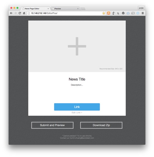
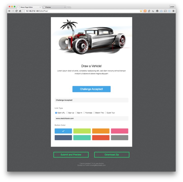
However, creating a webpage from scratch appeared to be too complicated for the marketing team. So we decided to create an editor for the marketing team to create the page.
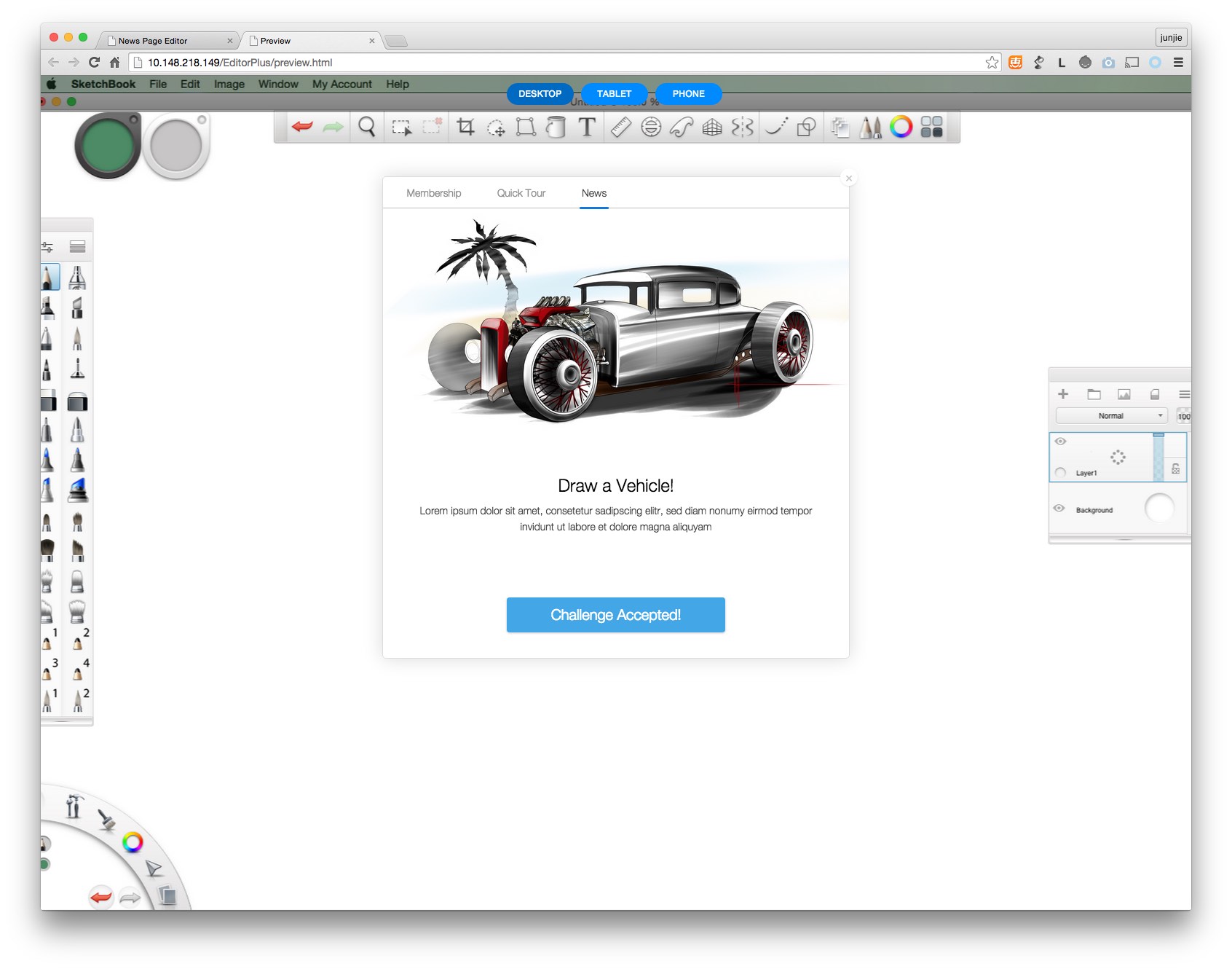
We pre-defined the page layout, the link behaviors, and even the colors of the buttons. What the content editor need to do, was simply replacing the images and the texts. We also created a preview page so that we could preview how the page would look like when it is pushed to the users.
We pre-defined the page layout, the link behaviors, and even the colors of the buttons. What the content editor need to do, was simply replacing the images and the texts. We also created a preview page so that we could preview how the page would look like when it is pushed to the users.
Now let's make it on mobile
The system worked out very well. The in-app-purchasing rate raised up since we can send the marketing events and sales info directly to the end users. The upgrading rate also climbed as users now could see more details about what’s being updated. We even could do in-app surveys to get feedback from the real users who are using the app everyday.
So we decided that, we should add this function into the mobile versions as well.
Since it’s just a web page, technically we only needed to add a few codes to make the page responsive, then it should work on all platforms. However, the tricky part was that the typical “responsive web design” only responses to the screen width, while on the mobile devices we also need it to response to the screen height.
After suffered a lot on adjusting the layouts to make it work on all possible screen sizes, we managed to add the functionality into the tool.
The localisation shit
It’s always a pain to deal with localisations. We have 24 different languages to work with, including Arabic which writes right-to-left. We had to control the localization strings to make sure they fit with the smallest screens. As a result, sometimes we even had to change the English strings in order to make all other ones work.
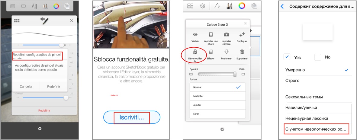
Since the notification page updates much more frequent than the app itself, keep checking the localisation every time makes the team exhausted. It felt that we were spending most of our time testing the localization instead of the app itself.
Due to the different screen sizes, it was also difficult to make the page look aesthetically beautiful on all different screens.
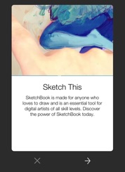
Our solution to solve these issues, was to create a fix-ratio dialogue. Both the image/video and the font sizes change according to the screen res. That makes sure the layout doesn’t change too much no matter how large or small the screen is. The actions buttons were put outside of the dialogue so that they are always available even if the strings are too long.
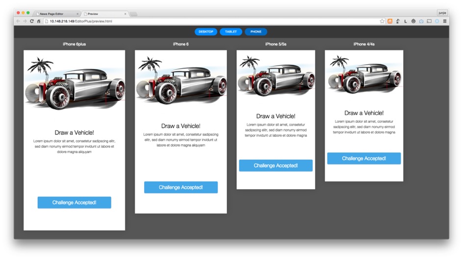
To make sure the dialogue look good on all devices, we made another preview page where you can add/remove any screen sizes and compare them side by side. There is also a DPI setting allowing you to change the scale of the preview screens. With a 60 inch TV display, we could project all the device screens in the exact same physical size.
In terms of localization, there is also a translation service built-in. The translation wouldn’t be accurate, the purpose is to help the designer/writer to have an LIVE view of what it would look like once they get localized. If in certain language it might get too long/short, we could give the localization team a headup before we ask them to do the translation, not after. The engineering team then, doesn’t need to waste too much time doing these boring testings and save the time focusing on the important jobs.
In terms of localization, there is also a translation service built-in. The translation wouldn’t be accurate, the purpose is to help the designer/writer to have an LIVE view of what it would look like once they get localized. If in certain language it might get too long/short, we could give the localization team a headup before we ask them to do the translation, not after. The engineering team then, doesn’t need to waste too much time doing these boring testings and save the time focusing on the important jobs.
